Working with the CSS Box Model
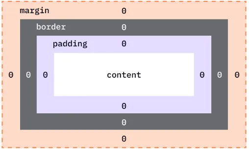
The box model consists of four main components, from the inside out:
-
Content:
- This is the actual content of the box, such as text, images, or other media. It is the innermost part of the box and defines the size of the element’s core area.
- You can control the size of the content box using properties like
widthandheight.
-
Padding:
- Padding is the space between the content and the border. It provides inner spacing within the box to ensure the content doesn’t touch the border directly.
- Padding is transparent and can be adjusted individually for each side:
padding-top,padding-right,padding-bottom, andpadding-left.
-
Border:
- The border surrounds the padding (if any) and content. It can have a width, color, and style (e.g., solid, dotted, dashed).
- You can style the border using properties like
border-width,border-style, andborder-color.
-
Margin:
- The margin is the outermost space around the border, separating the element from other elements on the page.
- Margins are transparent, and like padding, they can be adjusted on each side:
margin-top,margin-right,margin-bottom, andmargin-left. - The margin also helps with positioning and spacing between elements.
The total width and height of an element are calculated as follows:
- Total width =
width+padding-left+padding-right+border-left+border-right - Total height =
height+padding-top+padding-bottom+border-top+border-bottom
box-sizingproperty controls how the total width and height of an element are calculated.- By default, the
widthandheightproperties include only the content area. However, you can change this behavior using thebox-sizingproperty:
- The default value for the box model is
box-sizing: content-box;, meaning the width and height apply to the content area only, and the padding, border, and margin are added outside of it.
Example:
div { width: 300px; height: 200px; padding: 20px; border: 5px solid black;}Here, the total width of the element would be:
- 300px (content width) + 20px (left padding) + 20px (right padding) + 5px (left border) + 5px (right border) = 350px
- If you want the total width and height to include padding and borders, use
box-sizing: border-box;.
Example:
div { box-sizing: border-box; width: 300px; height: 200px; padding: 20px; border: 5px solid black;}Now, the total width of the element will remain 300px, including the padding and border.
| Property | Description | Shorthand | Example |
|---|---|---|---|
width | Specifies the width of the content area. | - | width: 200px; |
height | Specifies the height of the content area. | - | height: 150px; |
padding | Controls the space between the content and the border. Can be set for each side. | padding: top right bottom left; | padding: 10px 20px 30px 40px; |
border | Defines the border around the content. Can include width, style, and color. | border: width style color; | border: 2px solid red; |
margin | Defines the space outside the border. Can be set for each side. | margin: top right bottom left; | margin: 10px 20px 30px 40px; |
box-sizing | Specifies how the total width and height are calculated (including padding/border). | - | box-sizing: border-box; |
border-width | Sets the thickness of the border. | border-width: top right bottom left; | border-width: 2px 4px 6px 8px; |
border-style | Defines the style of the border (e.g., solid, dotted, dashed). | border-style: top right bottom left; | border-style: solid dashed dotted double; |
border-color | Specifies the color of the border. | border-color: top right bottom left; | border-color: red blue green yellow; |
padding-top | Specifies padding on the top of the content. | - | padding-top: 10px; |
padding-right | Specifies padding on the right of the content. | - | padding-right: 20px; |
padding-bottom | Specifies padding on the bottom of the content. | - | padding-bottom: 30px; |
padding-left | Specifies padding on the left of the content. | - | padding-left: 40px; |
margin-top | Specifies margin on the top of the element. | - | margin-top: 10px; |
margin-right | Specifies margin on the right of the element. | - | margin-right: 20px; |
margin-bottom | Specifies margin on the bottom of the element. | - | margin-bottom: 30px; |
margin-left | Specifies margin on the left of the element. | - | margin-left: 40px; |
-
Padding Shorthand:
padding: 10px 20px 30px 40px;/* top: 10px, right: 20px, bottom: 30px, left: 40px */css -
Margin Shorthand:
margin: 15px 25px 35px 45px;/* top: 15px, right: 25px, bottom: 35px, left: 45px */css -
Border Shorthand:
border: 2px solid red;/* width: 2px, style: solid, color: red */css -
Box-Sizing:
box-sizing: border-box;/* Includes padding and border in width/height */css
-
Padding (Two Values):
padding: 10px 20px;/* top and bottom padding: 10px, left and right padding: 20px */css -
Margin (Two Values):
margin: 15px 25px;/* top and bottom margin: 15px, left and right margin: 25px */css
* { box-sizing: border-box;}- Fixed-width layouts can break on different screen sizes. Use relative units like percentages (
%) or viewport units (vw,vh) instead of fixed pixel values for better responsiveness.
Example:
div { width: 50%; /* This makes the width flexible */}- Negative margins allow you to pull an element closer or overlap other elements. Use these carefully, as they can affect layout unpredictably.
Example:
div { margin-left: -20px; /* Pulls the element 20px to the left */}- When vertical margins (top and bottom) of adjacent block elements meet, they collapse into a single margin. The larger margin value takes effect. This behavior can be avoided using padding or borders.
Example:
div { margin-top: 10px; margin-bottom: 20px;}If the divs are adjacent, the total margin between them will be 20px, not 30px.
- To center a block element horizontally, use
margin: 0 auto;with a fixed width.
Example:
div { width: 50%; margin: 0 auto;}For centering vertically and horizontally, use Flexbox or Grid layout systems.
When working with the box model, it can be helpful to visually inspect the layout and element boundaries. Use browser developer tools (e.g., Chrome DevTools) to inspect and visualize the padding, borders, and margins around elements.
In DevTools:
- Right-click an element and select “Inspect.”
- Look for the “Box Model” section in the right panel, which shows padding, border, and margin dimensions.
- When using Flexbox, the box model still applies, but Flexbox properties (like
justify-contentandalign-items) control alignment and spacing. Flexbox can help distribute space more efficiently and center elements.
- CSS Grid provides a two-dimensional layout system where elements are placed into rows and columns. The box model applies to grid items, but you have more control over the size and positioning of elements using grid-specific properties like
grid-template-areasandgrid-gap.